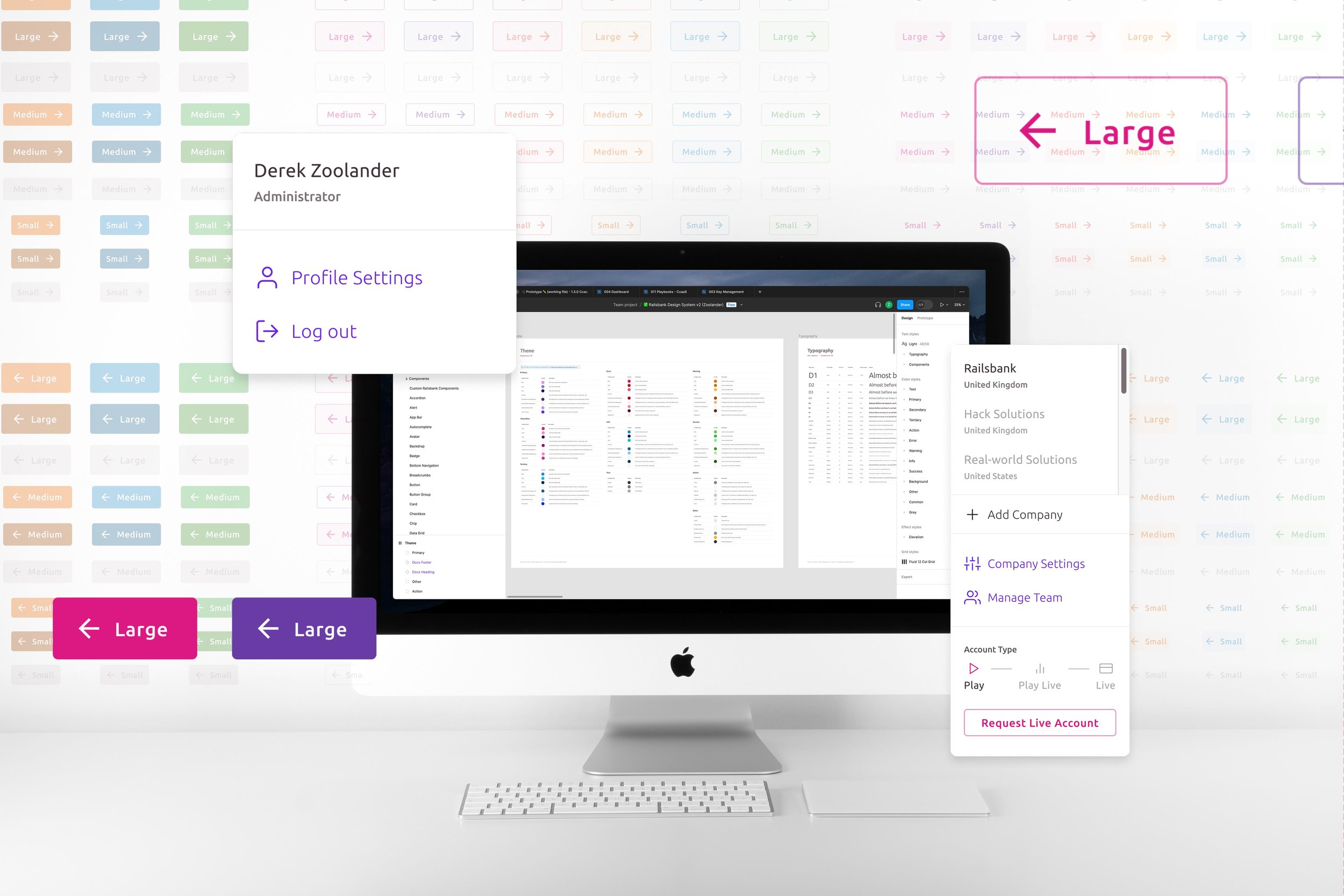
Building a Design System in Figma
Railsr operates in the rapidly growing sector of BaaS, providing a platform for businesses to integrate financial services into their own products. Recognizing the importance of design consistency and efficiency, Railsr worked on creating a design system using Figma.
Product Team: Group Product Manager, Product Manager, Content Writer, Product Designer, Development Team
Challenges
We encountered several challenges in its pursuit of a design system:
Lack of Consistency: With several designers on various teams working on different product components, inconsistencies arose in visual styles, typography, and user interface elements. This inconsistency created a problem of not having a unified user experience across products.
Collaboration Bottlenecks: We knew from past experience that design and development teams often suffered from inefficiencies, resulting in miscommunication, delayed handoffs, and rework. This would limit our team's ability to iterate quickly and deliver high-quality products.
Scalability Issues: As we brought on more designers, the lack of a centralized design system would hinder scalability. We didn’t want each new product to require extensive design exploration, resulting in redundant efforts and longer time-to-market.
Planning & Research
To overcome those challenges, we initiated an in-depth planning and research phase:
Establishing Goals: The team defined specific objectives for the design system, providing consistency, enhanced collaboration, and increased efficiency in our product development cycle.
Analyzing User Needs: User research was conducted to identify pain points and understand user expectations from the design system. Feedback from design, development, and product teams was collected to inform the system's requirements.
Design System Development
The development of the design system was divided into several key stages:
Design Principles and Guidelines: A set of design principles and patterns were established to create consistency across all products. These principles covered areas such as color palettes, typography, iconography, and spacing while the patterns included best practices and focused on how people navigated our product.
Component Library: A comprehensive library of reusable components was created in Figma. These components included buttons, form elements, navigation bars, and other UI elements.
Design Tokens: Design tokens were defined to manage variables such as colors, typography, and spacing. These tokens were used consistently throughout the design system and provided a centralized control point for design elements.
Iteration & Improvement
The development of the design system was an iterative process:
User Feedback and Testing: The design system was shared with designers, developers, and other stakeholders to gather feedback and identify areas for improvement. We wanted to ensure the system's effectiveness in addressing user needs.
Continuous Updates: I regularly reviewed and updated the design system to accommodate new requirements, address issues, and incorporate user feedback. The iterative process ensured that the system remained flexible and adaptable.
Conclusion
The design system facilitated consistent application of Railsr’s branding elements across all products, creating a unified brand identity. It improved collaboration by allowing several designers to work on varying products asynchronously but allowing us to come together to collaborate and spend time on solving the actual business goals and not knit-picking designs. We were able to create a robust solution that allowed us to design and iterate multiple features quickly. It improved our collaboration and allowed our team to be a real assets to delivering embedded finance experiences quicker that previously could be achieved.


